Kubbo
Together with the agency Plakton, we worked on the brand strategy and the new corporate identity for Kubbo, a logistics platform for eCommerce.
The goal of the project was to evolve the visual and verbal language of the brand in order to show a stronger brand personality and increase consistency across the brand touching points.
In order to differentiate from their competitors and attract a direct-to-consumer brands, we decided to work on the concept of care.
Brand strategy - Brand identity

We’ve created a new bold logotype which is mainly a wordmark to reinforce the name. This wordmark is accompanied by a flexible symbol that can adopt different sizes and layouts to create a rich and fresh graphic system.

Additionally, we reinforced the human component behind the SAAS with pictures of happy people, showed a curated selection of footage of real products so Kubbo potential clients can see themselves as real users and complemented pictures with illustrations.


Kubbo cares about you and your business and offers a trustworthy deliver solution that puts you and your brand in the center.


The new brand essence was anchored to the brand’s key attributes related with the concepts of movement, transformation, care and happiness.
In order to differentiate from their competitors and attract direct-to-consumer brands, we decided to highlight the concept of care and summarize the essence in the claim “Caring fulfillment for contemporary brands”. From this claim, we’ve defined a tone of voice which is optimistic & happy, caring & human and expert & transformative.


Nina Lualdi
Transforming Businesses & Organizations

Bistroo
We love food

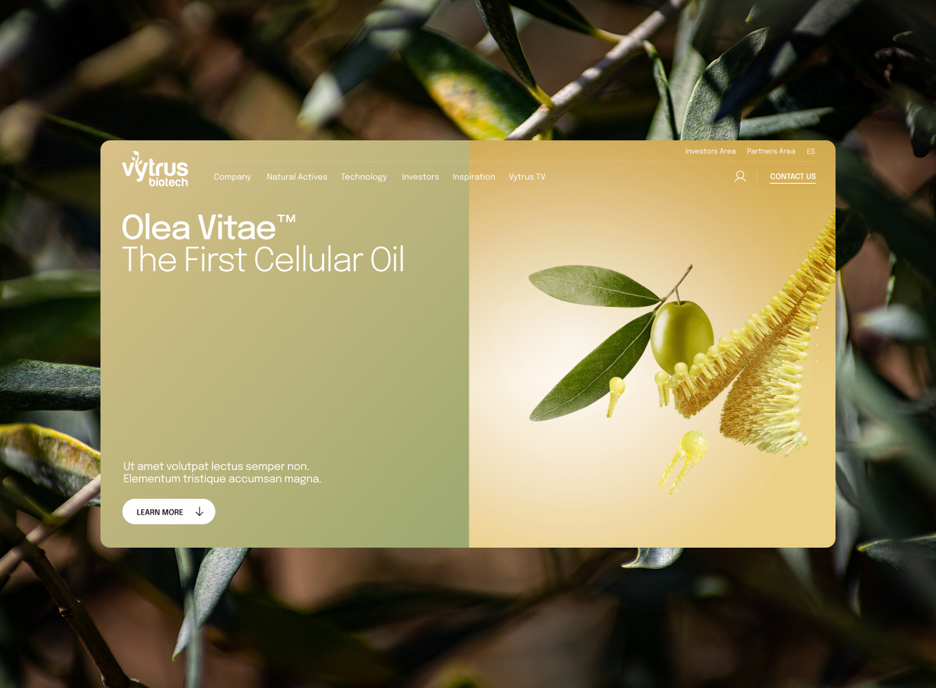
Vytrus
The real power of nature


